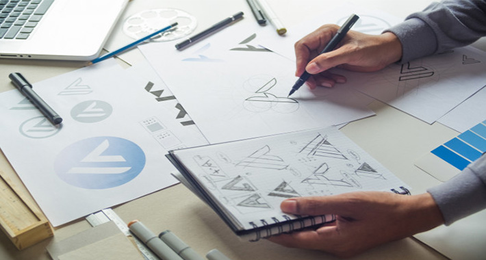
Are you the curious person who is always in lookout for latest logo designing trends? Do you wish to know what trends will become the talk of the town and which ones will die a swift death this year? If you’re nodding your head in a yes, then brace yourself, because we’re going to show you the top trends of logo designing in 2016.
- Negative Space Logo Design
It is always a good idea to be as simple as possible while creating logo designs. The more elements and colors you add the more it will be problematic for larger scale printing and it won’t be cost effective. If you want to stay simple yet creative you should follow negative space trend.
- Overlapping Gradients Logo Design
Shiny color schemes are implied while making overlapping gradients in the logo design. Normally web based companies ask for this technique to be used in their logo design for a greater impact and beauty.

- Bold & Thin Line Usage in Logo Design
Thin and bold lines are being used to draw the logo designs and there is no usage of filling object in this technique. It is made with the help of pen tool. Bold and thin line usage makes the logo design amazing.
- Brush Pen Usage in Logo Design
Brush pen was firstly used to compose Japanese and Chinese letters. Brush pen is also called fudepen. Hand letterers use this brush pen to make beautiful kinds of logotypes. Now this style is implied to write brand names and these styles have been widely used in packaging. This technique looks more like being drawn by a paint brush.
- Copperplate Script Calligraphy Usage in Logotype
There is also a technique of copperplate script calligraphy where oblique pen is used to give a retro feel to the logos. People are following it and liking this technique to be used in their logos.
Read more: Target Your Customers on Individual Basis

