
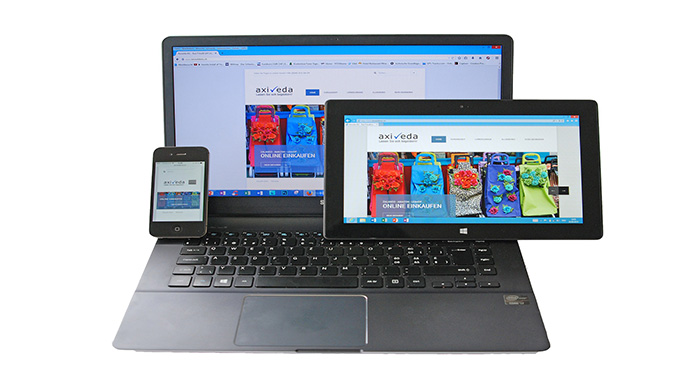
By the end of 2015, 4.43 billion people were using mobile phones to access the internet. This number is expected to be 4.61 billion by the end of 2016. This shows that having a mobile-friendly website has become a necessity now.
In order to grow your business rapidly, you need to make the users of your website loyal to it. To make them loyal, the website should fit into their criteria. There can be many reasons for a user leaving your website, such as:
- The design of your website doesn’t fit the screen of user’s mobile
- Website load time goes to infinity
- It is very difficult to search something on it

Following are the points that you can keep in mind to check the mobile friendliness of your website.
- Know Your Design: Developing a website isn’t quite enough. You must know its design thoroughly. Its content should be easy to scan. The clicks should be good enough for mobiles. Another thing is that the images should load properly.
- Make Search Easy: If it’s not easy to search something on your website through mobiles, then it is totally designed in a wrong way. Developers should keep in mind this thing that search should be done smartly. Add filters for the ease of the users.
- Make Content Unique: The content on your website should be well-written. It should have 100% impact on the user. It should be written in a way that the user doesn’t lose his interest. The content should be effortlessly readable for mobile users.
- Make Redirecting Accurate: The redirection should not take the user to the main page. This is a common mistake that designers make when they do website designing.
Testing your website after every two or three months and making sure that these points are checked can make your business grow rapidly.