
These days, almost every new client wishes a mobile version of their website. After all, it’s literally required to have one design for the iPhone, another for the BlackBerry, a netbook, an iPad, and a Kindle — and all screen resolutions must be compatible.In the next five years, we’ll almost certainly need to design for a few more inventions.When is this madness going to end?Of course, it won’t.
We’re soon approaching the point where we won’t be able to keep up with the endless new resolutions and devices in the world of Web design and development.
Creating a website version for each resolution and each device would be impossible, or at least impracticable, for many websites.
Should we just live with the consequences of losing visitors from one device in exchange for additional visitors from another? Is there any other option?
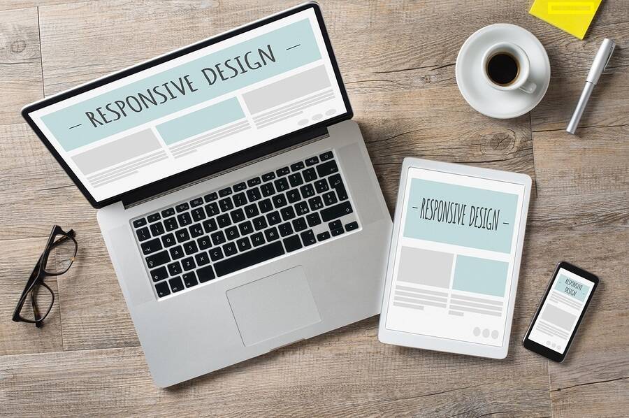
What is a responsive website?
Responsive Web Design (RWD) is a modern web design strategy that allows websites and pages to render (or display) across all platforms through responsive css code for all screen size via media queries.
Why Responsive Design is so popular
In the early 2010s, designers had to deal with a historic occurrence. Handheld devices were becoming more popular than desktop computers for accessing web content.
There were two main options available. Designers may create multiple variations of a single design, each with its own set of measurements (an approach called adaptive design). They might also work on a single, flexible design that can extend or shrink to fit the screen (responsive web Design).
The advantages of flexible design were difficult for businesses and designers to overlook. Designers were free to focus on just one design and let it flow like a liquid to fill all “containers” rather than working with absolute units (e.g., pixels) on different versions. Responsive design is not without flaws.
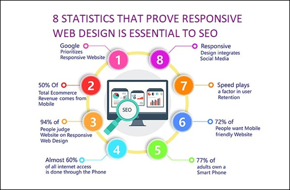
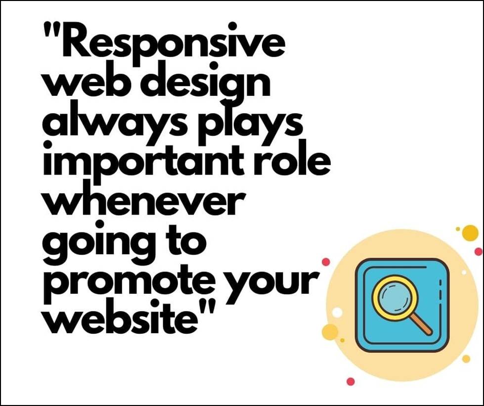
Nonetheless, it has major advantages, and its popularity has progressively increased. The number of free frameworks adapted to it has increased as well. Responsive design has become a requirement for numerous corporations (e.g., Google).
Is my website responsive?
You can rapidly check whether a website is responsive in your web browser.
- Launch Google Chrome
- Ctrl + Shift + I will open Chrome DevTools.
- By hitting Ctrl + Shift + M, you can access the device toolbar.
- Check out your page on a smartphone, tablet, or computer.
You may also use a free tool like Google’s Mobile-Friendly Test to see if your website’s pages are mobile-friendly.While other design approaches, such as adaptive design, can achieve mobile compatibility, responsive web design is the most popular due to its advantages.
Why is responsive web design important to web designers and business owners?
Because of responsive web design, web designers, user interface designers, and web developers no longer have to work 24 hours a day, seven days a week to construct websites for every available device.It also makes things very easier for business owners, marketers, and ad agencies.Here are a few advantages:
- One site for all devices: The website will be adjusted for the user’s optimal viewing pleasure whether seen on a 27-inch iMac with a Wi-Fi connection or from the screen of an Android phone.
- Device-optimized design: With responsive web design, all pictures, fonts, and other HTML elements are resized accordingly to fit whatever screen size the user has.
No need for redirection: Other approaches to designing for many devices necessitate the use of redirects to direct users to the correct version of a website. Without having to go through any redirects, the user may get to the content he wants to look at, as quickly as feasible.
In terms of cost, responsive web design is also advantageous. It is not essential to make changes twice.
Instead, you may update and work from a single website.
What is responsive web design testing?
Best Practice & Considerations for Responsive Design
You design for flexibility in every area of responsive design, including pictures, text, and layouts. So, here are some recommendations:
1. Use a “mobile first” strategy:
• Increase the size of phone-sized designs to accommodate larger screens.
• Always keep in mind that mobile users require buttons that are large (>40 points). Also, because the need for well-sized items on smaller screens can cause cramping and confusion, your design must be twice as intuitive as desktop equivalents.
2. Use design patterns to maximize ease of use and familiarity for users in their contexts: for example, the column drop pattern fits content to a variety of screen formats.
3. Use font sizes and styles that are accessible. Use mixture of contrast and background. Make headlines 1.6 times the size of the body content. Make all text responsive so that it shows in these proportions on all devices. Because some visitors use screen readers, make all of your text “actual” rather than embedded in graphics.
Overall, responsive design is a powerful and cost-effective strategy, although its “ease” can be deceiving. If you utilize it without caution, you may run into problems.
Adjusting Screen Resolution
As the number of devices increases, so do the screenorientations, definitions, and resolutions. Every day, new gadgets with the new screen sizes are released, and each of these devices may be capable of handling differences in size, functionality, and even color.
We must consider the hundreds of different screen sizes to designing for both landscape and portrait (and enabling those orientations to swap in an instant upon page load). You may organize them into key groups, design, and make each design as adaptable as feasible. However, this might be daunting, and who knows where usage will be in five years? Furthermore, many users do not maximize their browsers, which allows far too much room for screen size variation.
Flexible Images
Working with images is a major issue that needs to be addressed in responsive Web design. There are several methods for proportionally resizing photos, many of which are simple to implement. The most popular method, which was first explored with by Richard Rutter and mentioned in Ethan Marcotte’s post on fluid images, is to use CSS’s max-width for a simple remedy.
img{max-width: 100%;}
Unless the viewing area becomes shorter than the image’s initial width, every image will load in its original size as long as no other width-based image styles override this rule. The image’s maximum width is set to 100% of the screen or browser width, so as that percentage shrinks, the image shrinks as well.You don’t express the height and width of your pictures in your code, instead allowing the browser to resize them as needed while using CSS to guide their relative size.
Although max-width is not allowed in Internet Explorer, a good usage of width: 100 percent in an IE-specific style sheet will fix the problem nicely. Another issue is that in some older Windows browsers, when an image is shrunk too small, the depiction isn’t as clear as it should be. However, Ethan Marcotte’s essay contains a JavaScript that can be used to resolve this problem.
While the above is a terrific quick fix and an excellent place to start when it comes to responsive pictures, image resolution and download speeds should be the top priorities. While scaling an image for mobile devices is very easy, if the original image size was intended for large devices, it could dramatically slow download times and consume very unnecessary storage space.
Custom Layout Structure
We may want to modify the layout entirely for extreme size changes, either using a new style sheet or more efficiently through a responsive web design CSS media queries. This doesn’t have to be a pain; most of the styles can stay the same, but particular style sheets can inherit these styles and use floats, widths, and heights to shift elements around.
For example, we could define all of the primary structural components, such as #wrapper, #content, #sidebar, #nav, as well as colors, backgrounds, and typography, in a single main style sheet (which would also be the default). It’s also possible to set default flexible widths and floats.
We could detect this and transition to a new style sheet if a style sheet made the layout too narrow, short, wide, or tall. This child style sheet would inherit everything from the default style sheet, with the exception of the layout’s structure, which would be redefined.
Here is the style.css (default)content:
 /* Styles that will be carried over to the child style sheet by default*/
html,body{
   background...
   font...
   color...
}

h1,h2,h3{}
p, blockquote, pre, code, ol, ul{}

/* Structural elements */
#wrapper{
width: 80%;
margin: 0 auto;

background: #fff;
padding: 20px;
}

#content{
width: 54%;
float: left;
margin-right: 3%;
}

#sidebar-left{
width: 20%;
float: left;
margin-right: 3%;
}

#sidebar-right{
width: 20%;
float: left;
}
Here is the mobile.css (child) content:
#wrapper{
width: 90%;
}

#content{
width: 100%;
}

#sidebar-left{
width: 100%;
clear: both;

/* For our new layout, we've added some more styling.*/
border-top: 1px solid #ccc;
margin-top: 20px;
}

#sidebar-right{
width: 100%;
clear: both;

/* For our new layout, we've added some more styling.*/
border-top: 1px solid #ccc;
margin-top: 20px;
}
JavaScript
JavaScript is another option, especially as a fallback for devices that don’t support all of the CSS3 media query options. Fortunately, there is already a JavaScript library that allows earlier browsers to handle CSS3 media queries (IE 5+, Firefox 1+, and Safari 2). If you already use these queries, simply download the library and add it in your markup: css3-mediaqueries.js.
If you prefer a more hands-on approach, here’s a sample jQuery snippet that detects browser width and adjusts the style sheet accordingly:
<!-- wp:preformatted -->
<pre class="wp-block-preformatted"><<code>script type</code>="text/java script"<code> src</code>=<a href="https://ajax.googleapis.com/ajax/libs/jquery/1.4.4/jquery.min.js">https://ajax.googleapis.com/ajax/libs/jquery/1.4.4/jquery.min.js</a> /><code></code></pre>
<!-- /wp:preformatted -->
<!-- wp:preformatted -->
<pre class="wp-block-preformatted"><<code>script type</code>="text/javascript"><code></code></pre>
<!-- /wp:preformatted -->
<!-- wp:preformatted -->
<pre class="wp-block-preformatted">$(<code>document</code>).ready(function(){<code></code></pre>
<!-- /wp:preformatted -->
<!-- wp:preformatted -->
<pre class="wp-block-preformatted">$(<code>window</code>).bind("resize",<code> resizeWindow</code>);<code></code></pre>
<!-- /wp:preformatted -->
<!-- wp:preformatted -->
<pre class="wp-block-preformatted">functionresizeWindow(e){<code></code></pre>
<!-- /wp:preformatted -->
<!-- wp:preformatted -->
<pre class="wp-block-preformatted">var<code> newWindowWidth </code>=$(<code>window</code>).width();<code></code></pre>
<!-- /wp:preformatted -->
<!-- wp:preformatted -->
<pre class="wp-block-preformatted">// If screen width is below 600px, switch to the mobile stylesheet layout<code></code></pre>
<!-- /wp:preformatted -->
<!-- wp:preformatted -->
<pre class="wp-block-preformatted">if(<code>newWindowWidth </code><600){$("link[rel=stylesheet]").attr({<code>href </code>:"mobile.css"});}<code></code></pre>
<!-- /wp:preformatted -->
<!-- wp:preformatted -->
<pre class="wp-block-preformatted">// Else if width is above 600px, switch to the big stylesheet</pre>
<!-- /wp:preformatted -->
<!-- wp:preformatted -->
<pre class="wp-block-preformatted">else if(newWindowWidth > 600){<code></code></pre>
<!-- /wp:preformatted -->
<!-- wp:preformatted -->
<pre class="wp-block-preformatted">$("link[rel=stylesheet]").attr({<code>href </code>:"style.css"});<code></code></pre>
<!-- /wp:preformatted -->
<!-- wp:preformatted -->
<pre class="wp-block-preformatted">}<code></code></pre>
<!-- /wp:preformatted -->
<!-- wp:preformatted -->
<pre class="wp-block-preformatted">}<code></code></pre>
<!-- /wp:preformatted -->
<!-- wp:preformatted -->
<pre class="wp-block-preformatted">});<code></code></pre>
<!-- /wp:preformatted -->
<!-- wp:preformatted -->
<pre class="wp-block-preformatted"></<code>script</code>><code></code></pre>
<!-- /wp:preformatted -->There are a slew of options for combining JavaScript and CSS media queries. When it comes to pure CSS-based solutions, keep in mind that media queries aren’t an absolute solution, but they are wonderful possibilities for flexible Web design. We can now accommodate considerably more variants thanks to the use of JavaScript. Look at “Combining Media Queries and JavaScript” for further information on how to use JavaScript to mimic or work with media queries.
Here is ourmark–up:
<p class=”sidebar-nav”><a href=”#”>Left Sidebar Content</a> | <a href=”#”>Right Sidebar Content goes here blah blah</a></p>
<div id=”content”>
<h2>Main Content</h2>
</div>
<div id=”sidebar-left”>
<h2>A Left Sidebar</h2>
</div>
<div id=”sidebar-right”>
<h2>A Right Sidebar content</h2>
</div>
The connections to the sidebar content have been disabled in our default style sheet below. We can display this content on page load because our screen is large enough.
Here is the style.css(default) content:
#content{
width: 54%;
float: left;
margin-right: 3%;
}
#sidebar-left{
width: 20%;
float: left;
margin-right: 3%;
}
#sidebar-right{
width: 20%;
float: left;
}
.sidebar-nav{display: none;}
width: 54%;
float: left;
margin-right: 3%;
}
#sidebar-left{
width: 20%;
float: left;
margin-right: 3%;
}
#sidebar-right{
width: 20%;
float: left;
}
The two sidebars (below) are now hidden, and the links to these pieces of information are visible. When the links are clicked, the sidebars could be repositioned in the CSS to float below the text, and the links could invoke JavaScript to simply cancel the display: none (or in another reasonable way).
Here is the mobile.css(simpler) content:
#content{
width: 100%;
}
#sidebar-left{
display: none;
}
#sidebar-right{
display: none;
}
.sidebar-nav{display:inline;}
A design may be adjusted to accommodate a wide range of screen sizes and device types with the ability to simply show and hide information, rearrange layout elements, and automatically scale pictures, form elements, and more. Rearrange items to match mobile guidelines when the screen gets smaller; for example, to increase white space or substitute image navigation sources on mobile devices for greater usability, utilize a script or alternate style sheet (icons would be more beneficial on smaller screens).
Touchscreens vs Cursors
Touchscreens are becoming more and more common. It’s natural to assume that smaller gadgets are more likely to get touchscreen functionality, but don’t jump to that conclusion. At the moment, touchscreens are mostly found on smaller devices, but many laptops and desktops on the market do as well. The HP Touch smart tm2t, for example, is a simple touchscreen laptop with a standard keyboard and mouse that can also be used as a tablet.
Touchscreens have distinct design guidelines than simply cursor-based interactions, and they also have various capabilities. Fortunately, creating a design that works for both isn’t difficult. Because there is no cursor on a touchscreen, CSS hovers cannot be displayed; as the user touches the screen, they click. As a result, don’t rely on CSS hovers for link definition; they should only be used for cursor-based devices.
More suggestions can be found in the article “Designing for Touchscreen.” Many of the design concepts are geared toward touchscreens, but they aren’t necessarily incompatible with cursor-based usability. Because most people are right-handed, sub-navigation on the right side of the page would be more user-friendly for touchscreen users, as they would not accidently bump or brush the navigation when holding the device with their left hand.
Because this makes no difference to cursor users, we should stick to the touchscreen design rule in this case. Touchscreen-based usability can provide many additional guidelines of this nature.
Examples of responsive web design
To see how responsive web design works, use your smartphone to access the Internet and look at some of the sites listed on mediaqueri.es, an online showcase of examples of responsive web designs.
Examine the same sites on a different devices, such as your laptop or iPad. DevTools is also available in Chrome.
Conclusion
We are, without a doubt, approaching a new era in terms of Web design and development. There are far too many alternatives now, and there will be far too many in the future, to continue adapting and customizing solutions for each screen size, device, and technological innovation. Rather, we should usher in a new age now by constructing future-ready websites. Understanding how to make a design user-responsive doesn’t take much time or effort, and it can be a lot less stressful and time-consuming than learning how to design and code for every single device available.
The strategies outlined above, as well as responsive Web design, are not the final answer to the ever-changing mobile world. Responsive Web design is a notion that, when properly applied, can improve the user experience, but it does not fix the problem for every user, device, or platform. As technology advances in the coming years, we will need to constantly work with new devices, resolutions, and technologies to optimize the user experience.
Responsive Web design is not only convenient for us, but it is also beneficial to the user. Every customized solution improves the user experience. We can offer personalized solutions for a wider variety of consumers, on a wider range of devices, using responsive Web design. A website can be adjusted just as well for someone using an outdated laptop or device as it can for the overwhelming majority of people using the most up-to-date technology, and just as much for the few users who own the most advanced technology today and in the future. Everyone benefits from responsive web design since it creates a unique experience for them. We all strive towards that as Web designers every day on every project, right?
As web development Company, we also provide web designs and wordpress web designer services , please check them out as well.
Frequently Asked Questions (FAQs):
Q1) What exactly do you mean when you say “responsive design”?
Responsive design is a GUI based design strategy for creating content that converts to different screen sizes without losing its quality. Designers use relative units (percentages) and media queries to ensure that their designs adjust to the browser space and maintain content uniformity across devices.
Q2) How do I become a master in responsive web design?
To summarize, to create a responsive design, you must do the following:
1. You can add responsive meta tags in your HTML document.
2. Use media queries in your design.
3. Responsive pictures and embedded videos are a must.
4. Check that your typography is readable on mobile devices.
Q3) What are the principles of Responsive Web Design?
These are a few of the most useful strategies for responsive web design.
- Reduce friction.
- Thumb-friendly design
- Make use of the native hardware on mobile devices.
- By default, make the layouts flexible and adaptable.
- Take into account the landscape orientation.
- Make sure the typography is mobile-friendly.
- Use conditional loading to your advantage.
Q3) What size should my responsive design be?
The most regularly utilized resolutions across mobile, desktop, and tablet, according to the Worldwide Screen Resolution Stats (Jan 2020 – Jan 2021), are: 1920 x 1080 pixels (8.89 percent ) 1366.777 (8.44 percent ) 360 x 640 (7.28 percent )
Q4)What is the ideal picture resolution for websites?
It’s advisable to keep an eye on the pixel dimension of your photographs while you work on them. They should be OK for teaching as long as they’re at least 1024 pixels wide (for a horizontal image). The normal web image resolution is 72 PPI (also known as “screen resolution”).