

Building a website starts with a solid plan. It is where visual appeal meets functionality. The ultimate goal is to make visitors happy and help the business grow. A web design company in the UK ensures the platform is easy to use, loads quickly, and looks good on all devices. Developers also make sure the interface can be used by everyone and that search engines can easily index it. If you are making a new site or updating an old one, you need to know the basics of web design. Mastering these concepts can turn your online presence into a tool that really helps your business. Ultimately, a great website will bring in targeted customers and accelerate your growth. Web design is important for any business that wants a website. A web design company in the UK can help you make a website that really works.
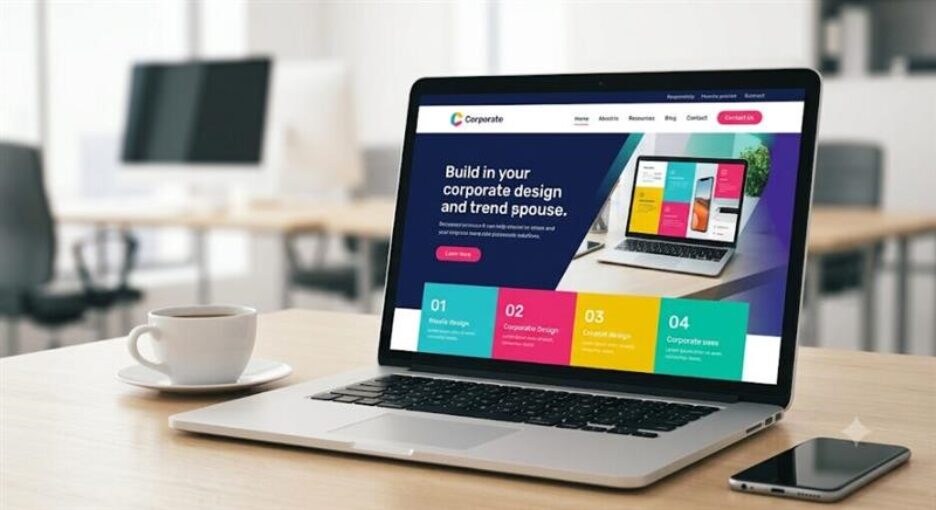
1. Defining High Performance in Modern Web Design
Unfortunately, “high performance” is usually boiled down to a single factor: speed. Although high load velocity is essential, a top-notch digital encounter is based on three inter-related pillars:
What Makes a Website High Performing
• User Engagement & Usability: Is it possible for a visitor to understand your unique selling proposition in three seconds or less and still have no trouble finding what they came looking for?
• Technical Efficiency: Is your site resilient across networks, browser types and hardware?
• Commercial Conversion Rate: To what extent does the user journey deliver people into taking really action—be it booking

2.Web Design UK Creating an Intuitive User Experience
User Experience (ux) Designers focus on the functionality of a website before considering its visual design. First frictionless navigation begins with information architecture (IA). Moreover, the IA process assists in organizing information needed for people to find what they are looking for on a website. As a result, users are able to navigate the website with ease
Conducting User Research and Creating Personas
It is essential to discover who exactly is visiting your website and what they hope to achieve before embarking on your design process There are some pointers
1.Define Secondary Personas
You should begin by mapping out your user personas, their expectations, technical proficiencies, and pain points.
2. Map Out Your User Journey
Map out your user journey based on their entry point (landing page/article) to the end conversion
3. Remove Friction Points
Avoid decision-making fatigue, multi-step processes, and intrusive pop-ups by eliminating friction points along the user’s
Nagivation menus that are too complex and bloated can turn away potential customers
Therefore, it is important to take cognizance of these design principles:
- The 7 Item Rule: It is best to only have seven items or fewer on your main navigation menu. This prevents choice paralysis among your website visitors
- Labels Should be Straightforward: Avoid jargon and nonsensical terms when labelling your web pages. Instead, use simple terms such as services, pricing, contact us, and about us.
- Sticky Headers: Make sure your primary navigation is sticky so that your visitors can access it even as they scroll down long articles
- Footer Links: The footer is a great place to add secondary links to supplemental web pages. Some of the links you can include are privacy policy, careers, press releases, and site map.

3. Visual Hierarchy and Modern UI Aesthetic
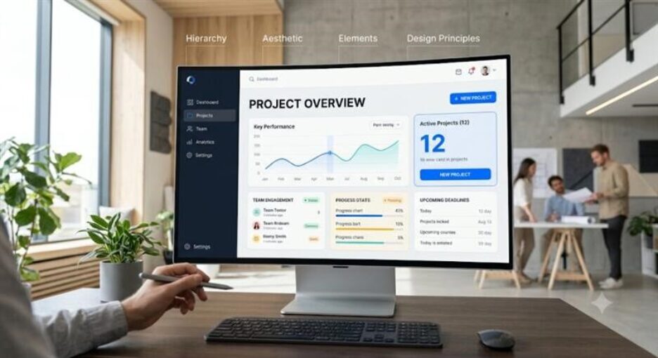
The visual hierarchy is what helps the users eye move across a page. It shows the stuff first and the not so important stuff second. So, a good User Interface design is about controlling what the user sees. It uses things like how things laid out how different they look how big they are and what colors are used.
Typography is really important for readability. It is the thing that people see on a website. That is why we need to follow some rules for typography. First, Avoid using too many different fonts. This helps everything look consistent. Keep line lengths within a comfortable reading range. There should be enough space between the lines. This makes it easier to read. We should also check that our typography looks good on-screen sizes.
* Limit Font Families: Most websites work best with one or two font families. that go together. Usually, we use a font without fancy bits for the main text and a stronger font for the headings.
* Line Length: The lines of text should not be too long. They should have, between 45 and 75 characters. This makes it comfortable to read.
* Line Height: We should leave space between the lines of text. The space should be one and a half times the size of the font. For example, if the font is 16 pixels the space should be 24 pixels. This makes it easy to scan the text.
4. First Approach to the Design
Understanding the Mobile-First Approach
Over sixty percent of website traffic worldwide comes from mobile devices. As such, designing for a desktop first and then trying to make it mobile-friendly causes websites to have slow loading speeds and poor layout.
It is essential to design from the mobile platform and then make it responsive to larger screen sizes
Mobile Layout that is 375 pixels wide ──► Table Layout that is 768 pixels wide ──► Desktop Layout that is 1200 pixels or wider
(We utilize the technique of progressive enhancement to enhance the mobile browsing experience by developing our site from the smallest screen size and then making it responsive to larger viewports.)
The following are principles of implementing Mobile-First Responsive Design.
Key Principles of Mobile-First Design
1. Designing for mobile devices (minimum width of 375px) followed by making the design responsive
We design for the mobile device with the minimum width of 375 pixels and make it responsive to other screen sizes. At this stage, we optimize the design based on the most critical elements, which should not be hidden or difficult to reach compared to other screens.
2. Making the elements on the website large enough to be easily touched by the thumb
We also make sure that the clickable elements on the website are large enough to be easily touched. At this point, we make the buttons and links 44×44 pixels and give enough space between the elements to avoid touching several elements at the same time.
3. Avoiding Horizontal Scrolling
To also enhance responsiveness in websites, we make sure that the elements that contain the layout fluid. This can be achieved by using percentages or other CSS grid techniques and flex containers in CSS while setting their width to 100%.
4. Making sure that images and videos respond to different screen sizes appropriately
Finally, ensure images and videos are responsive. Use HTML picture elements to load lower-quality media on mobile devices compared to desktops.

5. Accessibility and Inclusive Design (WCAG Compliance)
The website needs to be accessible to everyone, including people with disabilities like hearing problems or people who have trouble moving or thinking. This is called web accessibility. It helps people with disabilities use the website easily. It also makes the website better for all visitors. Helps businesses follow the law.
Core WCAG 2.2 Level AA Checklist
- Color Contrast: The text on the site should be easy to read. For instance, it should be at least 4.5 to 1 ratio compared to the background color, and 3 to 1 ratio for large headings.
- Keyboard Navigation: All the components on the site should be accessed using a keyboard. In particular, one should be able to navigate the site using Tab, Enter, and Spacer keys. In addition, one should be able to tell where on the website they are by the highlighted element.
- Screen Reader Compatibility: The website should use special HTML tags like header, nav and main. These tags help screen readers understand the website. They should not use tags like div.
- Form Labels & Errors: When people fill out forms, on the website, each part of the form should have a label. If they make a mistake the website should tell them what they did wrong in text not just with colors
- Meaningful Alt Text: If there are pictures on the website that convey information, they must have text that describes what the picture is. When a picture is used purely for decoration, the alt text should be left empty so that screen readers know to skip it.

6: Search Engine Optimization (SEO) & Machine Experience (MX)
Likewise, present day website design has to be seen for both human visitors and search engines. The way you structure the codebase of your site matters for how search engines and AI agents interpret and index it.
Technical On-Page SEO Essentials
• Heading: Follow the strict order of headers. There should be one and only one title tag on each page followed by subheadings of,,and.
• Structured Data (Schema. Also implement JSON-LD schema tags for Organizations, Articles, Products, FAQs (research these or Check rich snippets test tool preview to use json-ld schema.org Markup)
7. Designing Scalable Component Systems and Style Guides
Building a website without a design system creates inconsistencies and duplicate code. This ultimately leads to high maintenance costs in the long run.. A modular design system is very helpful because it gives rules for designers and developers to follow.
Design System Architecture
A design system begins with foundational elements the foundations of our design system, which include things like Color Tokens, Typography Rules and Spacing Scales.
Then we have the Atoms which’re the basic building blocks like Buttons, Form Inputs, Icons and Badges.
Next we combine these atoms to form Molecules, such as Search Bars, Card Headers and Form Fields.
After that we create Organisms which’re bigger components like Hero Sections, Navigation Bars and Footer Grids.
The Core Benefits of a Modular System are many.
- Design Tokens are very useful because they store design values, such as the brand colors, border radii, font sizes and elevation shadows as CSS variables or design tokens. If you update a token, the entire Design System and website will be updated instantly.
- We can also create Reusable Component Libraries, which provide components for things like buttons, product cards, testimonials and modal dialogs.
- This approach also helps with Maintainability, at Scale which means engineering teams can quickly push landing pages to production while making sure the brand looks the same across all global pages.

9. Making Sense of Core Web Vitals: Better Optimization for User Experience and Ranking
The guide talked about the metrics of Googles Core Web Vitals but it is really important to understand them well to stay ahead in search rankings and keep users from leaving. These are the three things that Google uses to decide if a site is really good from a machine point of view.
Largest Contentful Paint (LCP)
LCP (Concertful Paint). Making it Better: This is about how fast your site looks like it is loading to the human eye. To keep LCP under 2.5 seconds:
Make the Critical Rendering Path a Priority: Put off -important CSS and JS until the content at the top of the page is visible.
Use <link reel=”preload”>: Tell browsers to get your hero image or font file right away.
Upgrade Your Hosting: Sometimes LCP problems are because of slow server response times.
First Input Delay (FID)
FID (First Input Delay). Making it Better: This measures how fast a browser can react when a user clicks a button or uses the user interface. Good FID is under 100 milliseconds.
Reduce JavaScript Execution Time: This is usually the problem. Break up JS bundles into smaller pieces.
Minimize Third-Party Scripts: Things like chatbots, tracking pixels and ad tags often block the thread. Put off their load until after the user has interacted with the content.
Cumulative Layout Shift (CLS)
CLS (Cumulative Layout Shift). Making it Better: This is about stability. You must stop the page content from “jumping” around while it loads. Good CLS is under 0.1.
Reserve Space for Media: Always define height attributes for images, videos and frame containers.
Handle Dynamic Content: Never add content like banners or ads above existing content after the page has started loading. Core Web Vitals are important for User Experience and Ranking so understanding Core Web Vitals is key, to making an User Experience and getting a good Ranking.
10. Behavioral Analysis: Using Heatmaps to Fix User Friction
It is not very useful to know how many people visit your website if you do not know what they do when they get there. A web development company in UK can use this information to understand how people behave on a website and improve the paths to conversion.
Quantitative vs. Qualitative Data
The standard analytics tools like Google Analytics 4 tell you what is happening on your website as “Page X has a lot of people leaving quickly.”. Behavioral tools like Hotjar or Microsoft Clarity tell you why these things are happening by using qualitative metrics:
• Click Heatmaps: These show you where users are clicking on your website. If they are clicking on things that do not do anything that means there is a problem with your design that you need to fix.
• Scroll Heatmaps: These show you how down a page user is scrolling. If your main call to action is far down the page and most users do not get that far you are losing potential customers every day.
• Session Recordings: These are recordings of users using your website without knowing they are being recorded. By watching a few of these recordings you can find out if there is a problem with your website on mobile devices if your contact form is not working right or if your navigation is confusing people.
The Conversion Gap Assay
If you see that a lot of people are visiting your landing page but not many are converting, use tools to figure out what is going wrong:
1. Are people clicking the button but then leaving the form without finishing it? This could be because the form is too hard to use.
2. Do visitors leave your website without scrolling down to see what others think about your product? This could be because they do not trust you.
3. Have users repeatedly clicked on an image because they mistakenly think it is a button? This is a sign that your user interface’s confusing.
- Have product pages, use Product schema including pricing and availability. This allows Google to generate “rich snippets”—showing prices, ratings, and FAQ answers directly on the search results page.
- A vital part of both design and SEO. Use descriptive anchor text within your blog posts to link back to your service or product pages. This distributes “page equity” across your domain and helps crawlers index your site effectively.
Frequently Asked Questions (FAQs)
Q1: What exactly defines a “performing” website?
In web design performance is not just one metric; instead, it’s the intersection of speed, usability and results. A high-performing website is one that:
1. Loads Blindingly Fast: It passes Googles Core Web Vitals ensuring a user experience.
2. Is Intuitively Usable: It provides a User Experience (UX) where visitors effortlessly find what they need without confusion.
3. Converts Visitors: It uses structured Conversion Rate Optimization (CRO) strategies, such as headlines and strategic CTA placement to transform traffic into measurable leads or sales.
Q2: Why does website load speed matter if I have content and design?
You cannot benefit from your design or content if the user leaves before they see it. Therefore, speed is the bedrock of performance for three reasons:
• User Retention: For example, over half of mobile users abandon a site if it takes longer than three seconds to load.
• Conversion Rates: Furthermore, a delay of one second in page load can reduce conversions by up to 7%.
• SEO: Finally, Google uses speed, Core Web Vitals as a direct ranking factor. As a result a fast site ranks higher.
Q3: How do I measure my websites performance?
Several powerful free tools can analyze your sites performance. For example:
• Google Page Speed Insights (PSI): This is the gold standard for testing Core Web Vitals (LCP, FID, CLS) on both mobile and desktop. In addition, it provides lab data and recommendations for improvement.
• Tetrix: Furthermore, it offers a Waterfall chart showing the exact loading sequence of every element, including images, scripts and CSS helping to identify bottlenecks.
• Google Analytics 4 (GA4): Finally, it helps you track performance on the user side measuring metrics like engagement time, conversion rates and bounce rates.
Q4: My current website is “responsive”; isn’t that the same as “first design”?
No and understanding the difference is key to performance.
• Responsive Design: This means you design the website for a desktop first and then write code (CSS) that forces the layout to shrink, reflow or hide elements to fit screens. As a result, this often leads to slow code on mobile.
• Mobile-First Design: In contrast this is a philosophy that starts the design process with the viewport, such as a mobile phone and adds only essential content first. In addition, you focus on thumb- interactivity and speed. Once that core experience is perfect you progressively enhance the layout for tablet and desktop viewports. Consequently, this results in code and a faster experience on the device where 60% of traffic originates.
Q5: My developer uses a “design system”; what is the benefit for me?
A design system is a repository of pre-approved reusable components, such as buttons, forms, cards, colors and rules. As a result, it can provide benefits for your website build:
• Efficiency & Speed: New pages can be assembled rapidly dramatically reducing development time and cost.
• Visual Consistency: Furthermore, every component uses the spacing, typography and brand colors ensuring a seamless high-quality look across the entire site.
• Maintainability: Finally, if you need to change your brand colour you update it in one place the design system token and it updates across your entire website.
Q6: What does SEO have to do with website performance and design?
Everything. Great design and speed are parts of SEO. Therefore, googles goal is to present users with the quality most usable result. Performing web design supports this by:
• Technical SEO: Clean code, fast loading (Core Web Vitals) and mobile-friendliness directly improve rankings.
• Semantic Structure: In addition, using semantic HTML tags (<h1> <nav> <article>) allows search engines (and AI) to better understand the meaning and context of your content.
• User Signals: Finally, sites that load quickly and are easy to navigate can have bounce rates and higher “time on page ” signals that tell Google your site is valuable.
with no headings, contrast or negative space, which overwhelms visitors. As a result, clear visual hierarchy helps visitors scan and understand the content easily.